Galesburg Public Library Concept
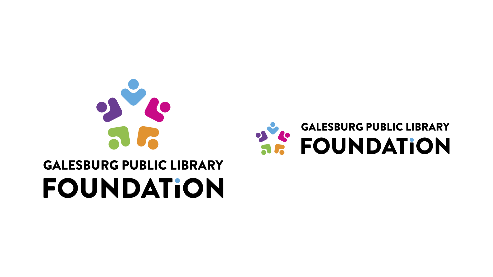
This concept for Galesburg Public Library’s new visual identity is inspired by growth, the community and being the central hub of information in the Galesburg community. The new logo reinforces the idea that the community can come together to a central location to meet their needs. Much like the Illinois state flower, a common blue violet, the new mark reflects growth and consists of five elements around a center point, each representing someone holding a book. The lowercase “i” brings a modern twist, connecting how the library has a vast source of information. A bright new color palette, with some original colors still incorporated, showcases how the new logo is more welcoming and inclusive to those who use the library.
The Galesburg Public Library Foundation logo was given a similar treatment.
*This project uses conceptual art. Final design may vary.


